| Log In | Not a Member? |
Contact ADC
|
|
Return to Index
Instructing Fonts
Contents
IntroductionA quality outline font is one that provides legibility at small sizes on low resolution devices and fidelity to the original design at large sizes and on high resolution devices. Chance effects due to interactions between the outline shape and the placement of the grid should be minimized. This section will describe how to instruct a TrueType font to ensure that it has the properties just described.
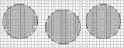
Rasterization and the gridOne simple technique for converting a glyph outline to a bitmap is to superimpose the outline onto the raster grid. All pixels whose centers fall inside or on the grid would be part of the bitmap image to be generated. All others are not.The result of employing this rule in rasterizating a circle is shown in Figure 1. The figure reveals some of the shortcomings in this simple rasterization technique.
Specifically, the results vary with the exact placement of the outline in the raster
grid and the shape generated is not symmetric either from left to right nor from top to
bottom, as would be desirable in a circle. Figure 1 Bitmap varies with placement in the raster grid
It would be preferable for a given outline to always produce the same result when
rasterized at a given size on a given grid. Important properties (like symmetries)
should be preserved when a shape is rasterized. Problems of this sort are not simply of theoretical importance but can affect the
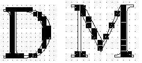
legibility of digital typefaces. Common problems produced by uncontrolled rasterization include the uneven stem weights, dropouts,the loss of character features,
and serif asymmetries. Some instrances of such problems are shown in Figure 2. Figure 2 Rasterization problems
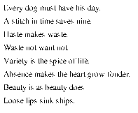
The net result is letters that are illegible at small sizes and inelegant at larger
sizes. The difficulties inherent in reading such text are illustrated in Figure 3. Figure 3 Chance effects produce illegible text
Rasterization problems will eventually disappear as resolution or point size increases.
Such improvements, however, do not come quickly enough for users of screen fonts nor, in many cases, for those printing on 300 dpi devices. As size and resolution increase, legibility will improve but elegance and fidelity
to the original design remain at issue even at relatively high numbers of pixels per em.
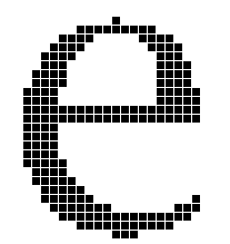
This problem is illustrated in Figure 4. Here, the bitmap produced by dumb rasterization (left) is legible but inelegant. Among the more glaring problems are
the widowed pixel at the top of the e, the jagged shape of the lower curve, and the poor
appearance of the counter. Figure 4 10 point uninstructed New York e at 300 dpi
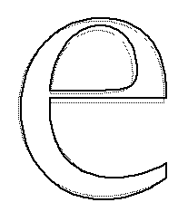
The TrueType language seeks to remedy the problems caused by the accidents of rasterization by deforming a glyph outline before rasterization so that the "right"
pixels are turned on. This technique, illustrated in Figure 5, is called "grid-fitting" the outline. Here the darker outline imposed on the lighter master outline is represents
the outline that will be rasterized to produce the final output bits used to represent
the glyph. Figure 5 10 point New York e outline after grid-fitting
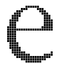
When the grid-fitted outline is set to the rasterizer, the result has a more pleasing
appearance that more closely resembles the design captured in the master outline. Figure 6 10 point instructed New York e at 300 dpi
As the previous discussion suggests, some of the goals for grid-fitting are as follows:
It is, however, possible to further refine these general ideas into a set of goals
that can be expressed in the TrueType language. These ideas are described, in more concrete
terms, in the next several sections.
Instructing fontsThis section provides an overview of the tasks involved in instructing a TrueType font. The techniques presented can be used in the "hand" instructing of fonts. An understanding of these techniques should be useful to those contemplating writing an auto-instructing tool or to anyone needing a low level understanding of instructing process.
Determine the intended useIn instructing a font it is important to decide the minimum number of pixels per em at which the font is expected to be used. If it is intended for use only on printers or typesetters, the task of instructing is vastly simplified. Typically the goal is a font that is readable at screen sizes on a 72 dpi device. That might mean instructing a font down to 9 pixels per em.
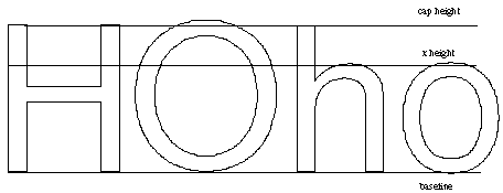
Consider the font has a wholeIn instructing glyphs, it is important to preserve the overall look of the font and the relationships between glyphs. To accomplish this it is important to identify key dimensions, such as the cap height, x-height and baseline that apply to the font as a whole. At small pixel per em sizes, subtle variations in these dimensions are not possible and drastic differences will be disasterous.In a Roman font, the upper case 'H' and 'O' and the lower case 'n' and 'o' are typically
used as control characters for the purposes of determining the cap height and the
x-height for straight and round characters. These characters can be useful in building
the control value table. Figure 7 Key vertical dimensions in Roman fonts.
Consider the individual glyphsDetermine which character features need to be preserved. At small pixel per em sizes, some aspects of the design might need to be sacrificed. Therefore it will be necessary to set priorities.Key features to preserve include the stem weights which should be even within a given character
and which should break at the same time across similar glyphs in a
font. Other features which typically merit attention are serifs, stem widths and diagonals.
Control the white spaceIn grid-fitting a glyph the goal is to control not simply what pixels make up that character upon rasterization but also the space between strokes and between glyphs. At screen sizes, in particular, controlling white space is a critical task. Unless instructions keep tight control over side bearings there is the likelihood that characters will collide on the screen impairing the appearance of text and destroying readability. Failure to control the space between strokes can result in glyphs that look like black blobs.
Control the advance widthPreserving the advance width is important to ensure consistent spacing. Often there is a conflict between obtaining the best spacing possible on the screen and obtaining the best possible spacing on the printer. For example, if a decision is made to round the right side bearing to the grid, the original advance width of the glyph will be changed slightly. Depending upon the size at which the glyph is being rendered, the effect can be to round the value up or down. These errors can be exaggerated at printer sizes producing highly undesirable effects.It is important determine what the most important use of a font when instructing advance widths.
Typically, a high priority is placed on preserving the advance widths
of the most frequently used glyphs.
Avoid regularizing featuresFor optimal results, a font instructor should follow these guidelines:
Using the control value table to coordinate features across glyphs will achieve a
desirable uniformity in, for example, x-heights, at small sizes. It can also lead
to regularization at larger sizes. For example, the cap height of the upper case round
glyphs may differ by a few units. At small sizes, it is correct to ignore these subtle
differences because there are too few pixels to properly represent them. At large
sizes, the designers intention must be allowed to reemerge. TrueType solves this problem by use of the control value table cut-in value.
The acceptable "small amount" is the control value table cut-in, the difference at
which the table value is preferred. When instructing a font, it is important to be
conscious of the effect of the cut-in. The cut-in can be changed from its original
default value or turned-off entirely in cases where the table value in always preferred.
Handle exceptions lastRobust instructions should handle most of the grid-fitting needs in a font. If the result obtained for a particular glyph at a particular size are disappointing, use a DELTA instruction to obtain the desired bitmap. DELTAs should be used sparingly and only after the non-size specific instructions have been applied.
The example fontsIn the next several sections, these general ideas will be applied to the problem of instructing four characters using the TrueType language. The characters are from two different fonts: New York and Geneva. These are the TrueType renditions of the original Macintosh bitmap faces of the same name. They provide examples of instructing serif and sans serif faces.The four examples that follow will approach the task of instructing a glyph as a three
step process:
For each glyph, an analysis will be made to determine what features are most important to preserve. Dimensions that must be coordinated across glyphs in the font
will be entered into the control value table. Finally an illustrated and annotated
look at the instructions for each glyph will be provided. A formal specification of each of
the instructions used can be found in the Instructions section.
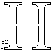
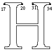
New York: The upper case HThe New York H is used to illustrate the instruction of an upper case serifed straight glyph in a Roman font. Some upper case straights are shown in Figure 8.Figure 8 Upper case straights
Determining the key featuresThe problem in instructing the upper case H can be divided into two sub-problems,
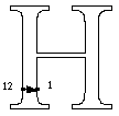
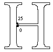
controlling distances in the x-direction and controlling distances in the y-direction. The key distances in to be controlled in the x-direction are shown in Figure 9. They are:
Figure 9 New York H: Controlled distances in the x-direction
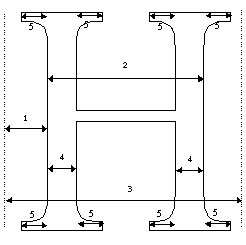
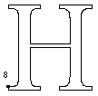
The key distances to be controlled in the y-direction are shown in Figure 10. They are:
Figure 10 New York H: Controlled distances in the y-direction
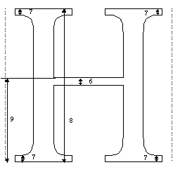
Creating the control value tableThe upper case H has features in common with other upper case straight glyphs in this font. The need to coordinate key dimensions in this glyph with key dimensions in other related glyphs suggests the need for a number of control value table entries.The control value table entry for the cap height of the H is derived from an analysis
of the heights of related letters in the font. As shown in Table 1 below, entry 2 has the value
1552. Examining the font data shows that this is indeed the height of the H.
It is also the height of related glyphs such as the I, K and the L. To create control value table entry 4, the upper case stem width, it is necessary
to look at the widths of the stems in key glyphs across the font and find a value that is
acceptable for all. One possible approach is to average the related values. Once the value is determined, the necessary control value table entry should be entered in the
control value table. As the geometric analysis suggests and the instructions that follow will reveal, the instruction of the H will require several control value table entries. They are shown in Table 1.
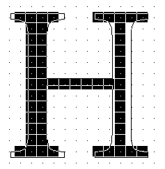
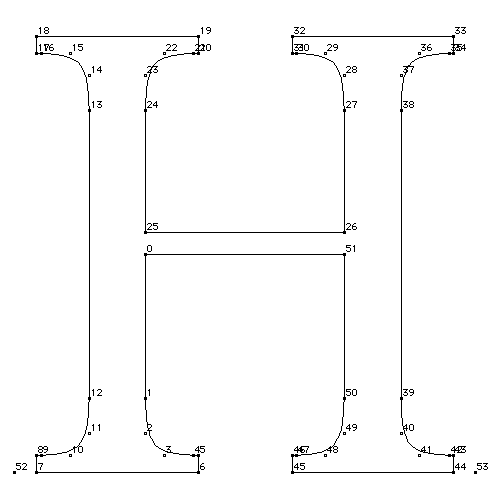
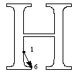
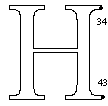
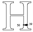
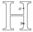
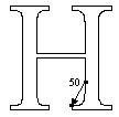
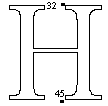
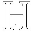
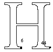
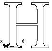
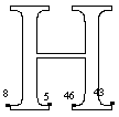
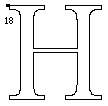
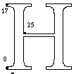
The instructionsThe grid-fitting instructions for the H necessarily refer to the outline points that make up the glyph description. Figure 11 shows the upper case H outline along with the on-curve and off-curve points that define that outline. The instructions for this glyph follow. Each instruction is accompanied by an explanation of the work it does and, if relevant, an illustration of the points it affects or uses.The instructions begin with the x-direction, the default direction for the freedom and projection
vectors.The work of instructing the glyph proceeds from left to right.
Instructions80% in the y-direction follow. Not all of the outline points that define the glyph shape need to be instructed. Key
points are moved to the desired location. An interpolation is used to "bring along"
the remaining points in the glyph outline. Figure 11 Uppercase upper case York H
The first set of instructions applied to the New York H controls the placement of
the glyph within its advance width. A slightly more sophisticated method of controlling placement of the glyph would be to cluster common left side bearings, and to MIRP[] them from the origin point with a designated control value table entry.
The next set of instructions is used to control the space to the left of the glyph.
This is accomplished by the MIRP[] instruction controls the distance from a key point on the
left stem to the origin point. The reference point, rp0, is changed in preparation
for the next instruction. By choosing not to set the minimum distance Boolean, the instructor has decided that
at small pixel per em sizes, when the number of available pixels for rendering the
glyph are few, this distance will be allowed to disappear. Setting the third Boolean in the MIRP[] instruction causes the value to be rounded
(using the default round state which is round to grid). Additionally, the cut-in
is used.
The next several instructions are used to control the outer serifs on the left stem.
The first MIRP[] controls the length of the lower outside serif. Setting the minimum distance
Boolean ensures that the serif will not disappear.
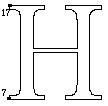
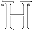
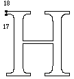
The SHP[] instruction makes it possible to coordinate the length of the upper left
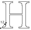
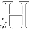
outside serif with the lower left outside serif. Point 17 is moved to a new location
that derives from the grid-fitted location of point 7.
Continuing the "outside in" approach, the next feature to be controlled in the left
stem. Its weight is linked to control value table entry 4 which contains the upper
case stem weight value to be used when the cut-in test is made. Tieing this value to the
control value table entry means that all similar values will jump to the next largest
pixel value at the same time. The minimum distance Boolean is set to ensure that the stem will not
disappear.
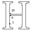
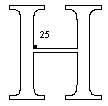
Since the previous instruction may have moved point 1, it is necessary to control
the intersection of the crossbar and the left stem. This is accomplished by aligning points
25 and point 1. Point 25 is too far away from point 1 to be "brought along" by the
subsequent interpolation in the x-direction, whereas point 0 (which is between point
1 and another touched point) will be moved appropriately. The ALIGNRP[] instruction
insures that they will be kept along the same vertical axis.
The next instruction controls the length of the serifs on inside left stem. The Boolean settings
are the same as in the previous instruction for the outer serif. This is
accomplished with a shift instruction.
As with the outer serifs, it is necessary to coordinate the length of the upper right
inside serif with the lower left inside serif.
Continuing left to right across the glyph, the next set of instructions control the black body
width. This is a black distance.
At this point, the instructing proceeds from the right outside portion of the glyph
towards the left. The right outside serif length is controlled in a manner similar to the left outside serif.
The upper outside serif is aligned with the lower using a SHP[] instruction.
The right main stem weight is controlled in much the same manner as the left stem.
A key point on the upper stem is aligned with a key point on the lower stem. That
point may have been moved in controlling the stem width.
The right inside serifs are controlled in the same manner as the left. In some cases,
it might be preferable to turn off the minimum distance Boolean in the MIRP[] instruction that
follows. The effect would be to make the inner serifs diappear rather
than colliding at small sizes.
The shift instruction is used to align the upper and lower serifs.
Instructing in the x-direction is now complete. The remaining instructions work in the y-direction.
The first step is to reset the freedom and projection vectors to the y-axis.
The MIAP[] instruction is used to control the relationship of a key point to the baseline.
The Boolean is set, indicating that both the control value cut-in and round state are used in
determining the action taken.
The ALIGNRP[] instruction aligns the previously moved point with the corresponding
point on the right serif.
Working from bottom to top, the next set of instructions control the height of the bottom serifs.
The lower left serif is tackled first.
Once a single serif height is established, it can be applied to all of the lower serifs
with an align instructions.
The next set of instructions control the relationship of the top of the H to the cap
height using an indirect instruction and a control value table entry.
The changes made to the top left serif are now applied to the right.
Working down from the top of the glyph, instructions are used to control the height of the upper serifs.
Now all of the bottoms of the upper serifs can be aligned to conform with the changes
made by the previous MIRP[] instruction.
Since the top and bottom of the glyph may have changed positions, it is necessary
to control the relationship of the crossbar to the glyph as a whole. A reference point
is set for use in controlling the crossbar height.
The height of the crossbar is interpolated between the baseline and cap height to
preserve its relative position between the top and the bottom of the glyph.
Now that it has been interpolated, the point connecting the crossbar with the left
stem is rounded to the grid and touched to prevent its being moved by future interpolations.
The height of the crossbar is controlled using a control value table entry.
Finally, all the changes made will be distributed among the points that were unaffected by the
previous instructions. The IUP[] works by interpolating the position
of each untouched points relative to the nearest pair of touched points, with each
touched point being on either side of the untouched point along the contour. See
the Instructions section for
more information on the IUP[] instruction. Note that the interpolation is performed first in the x-direction and then in the
y-direction so that the position of untouched points can be adjusted in both directions.
New York: The upper case OThe New York O is an example of an upper case round glyph. The O, alongwith some other upper case rounds in the New York face, is shown in Figure 12.Figure 12 Upper case rounds
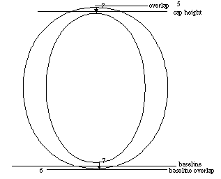
Among the special problems faced in instructing these glyphs is the fact that, rather
than sitting on the baseline, they overlap it. At small pixel per em sizes, there
will not be enough bits to allow for such an overhang. At larger sizes, the original design
must be preserved.
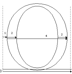
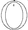
Determining the key featuresIn instructing the upper case O, the features shown in Figure 13 need to be controlled.
In the x-direction, they are:
Figure 14 New York O: Controlled distances in the y-direction
Creating the control value tableTo instruct the capital 0, it is necessary to extend the control value table for New
York to include new entries.
Table 3-2 : Control value table for New York
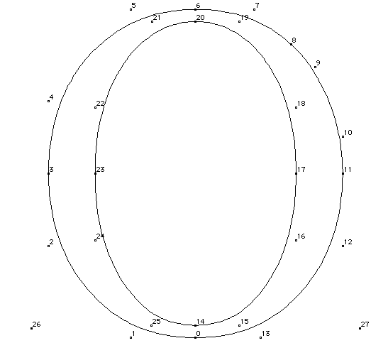
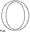
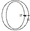
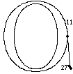
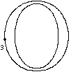
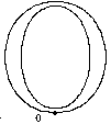
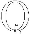
The instructionsThe instructions for the New York O follow. They refer to outline points shown in Figure 15.Figure 15 The New York upper case O
Two distinct approaches to instructing this glyph in the x-direction are presented here.
Controlling both the left and right side bearings will produce better looking integer spacing
on the screen at low resolutions, but it requires careful attention that the advance width is
not drastically affected. This approach is shown first. An alternative approach is briefly described
just before instruction in the y-direction is discussed. Begin by setting rp0 to the left phantom point.
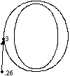
Control the left side bearing by tieing the distance between points 26 and 3 to control
value table entry 10.
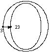
The width of the left round stem is tied to the value in control value table entry
12. The stem will change in coordination with other similar stems in the font. Setting
the minimum distance Boolean prevents the stem from disappearing at small sizes. The distance is
rounded. Use the control value table is subject to the cut-in.
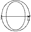
The next instructions control the black body width of the glyph.
The right round stem is controlled in a manner similar to that of the left stem.
The right side bearing of the glyph is controlled with a control value table entry,
much as the left side bearing was controlled earlier. The minimum distance is not
respected and, as a result, this distance can disappear at small pixel per em values.
If you choose not to instruct the position of the glyph within its advance width,
begin by rounding point 3 to the grid and locking it in place. Then proceed to instruct
the left stem, the body width and, finally, the right stem.
Before instructing the vertical distances, the freedom and projection vector are set
to the y-axis.
The next set of instructions are used to control the baseline overlap. An indirect
instruction (MIAP[]) is used to tie the glyph to the baseline at small sizes while
allowing the overlap to return once there are a sufficient number of pixels available. Two things are happening here. Common round stems are being set to some overlap. Overlap is
set to zero by the control value program for some set of point sizes.
A MIRP[] is used to control the height of the lower horizontal round stem. Setting
the minimum distance Boolean prevents this horizontal stem from disappearing.
The cap height of the glyph is controlled using a the control value table entry for
upper case round.
The horizontal stem width is controlled by the MIRP[] instruction.
The positions of all untouched points are adjusted with an interpolation in the x-direction
and an interpolation in the y-direction.
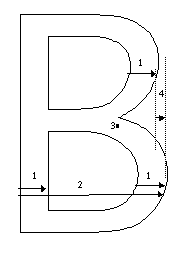
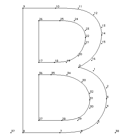
Geneva: The upper case BThe upper case B has both straight and round stems, a cross bar and a difficult to control "indentation" where the two round stems meet the crossbar.Figure 16 Glyphs with straight and round stems
Determining the key featuresFirst the features to be controlled in the x-direction are set.
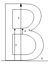
Figure 18 Geneva B: controlled distances in the y-direction
Creating the control value tableThe control value table entries needed to instruct the Geneva B are shown below.Table 3 : Control value table for Geneva
The instructionsThe instructions for the Geneva B are presented below. The point numbers referred to in the instructions are shown in Figure 19.Figure 19 Geneva upper case B
The instructions begin with a simple method of handling a glyph's black body width and
placement within the advance width. The origin point and advance point are not touched, making the integer advance width
always equal to the rounded fractional width. This provides the most accurate placement and
width for printer sizes First, distances in the x-direction are controlled. By default the freedom vector and
projection vector point in this direction. The instructions begin by locking point 8 to the nearest grid line. The effect will
be to align the black body width to the grid.
A MIRP[] instruction is used to control the main stem width. This value is coordinated with
other similar values using a control value table entry. This technique
ensures that stem weights will break at the same pixel per em value when the cut-in
test fails.
The next instruction ensures that the left sides of both counters will be aligned.
A shift instruction is used in preference to the ALIGNRP[] instruction because SHP[0] keeps
rp0 at point 8 for the next move instruction. ALIGNRP[] would have required moving rp0 to point 27.
SHP[0] does not. This saves one SRP0[] instruction.
The next instruction preserves the original outline black body width for the glyph
subject to rounding.
The lower round vertical stem is "mirped" to the same control value table entry as
the left straight stem.
The original outline distance between points 14 and 13 is restored, subject to the
round state, using MDRP[].
The upper round vertical stem is controlled using control value table entry 2, the
entry used for the other stems.
Reference point 1 is reset in preparation for the interpolation to come.
Interpolating point 0 between points 14 and 27 ensures that its relative position
between those points is restored to what it was in the original outline.
With instructions in the x-direction complete, the freedom vector and projection vector are
set to the y-direction.
Point 7 is held to the baseline by linking it to the value in control value table
entry 1.
The height of the horizontal stem is controlled by linking it to the value in control
value table entry 3, the horizontal stem height.
The height of the B is controlled using an indirect instruction tied to control value
table location 2, the cap height.
The upper horizontal stem is controlled using the same control value table entry as
was used for the lower.
The reference point rp1 is set to point 27 in preparation for an interpolation used
to reestablish the position of point 17 relative to points 26 and 27.
Once the position of point 17 is adjusted, it is rounded to the grid and touched so
that it will not be moved by future interpolations.
The width of the cross bar stem is controlled using the control value table entry
for horizontal stems.
Point 0 is interpolated between points 17 and 36. This adjusts the vertical position
of this point much as a previous interpolation adjusted its horizontal location.
Adjust the position of all untouched points relative to those points that have been
affected by the instructions. Adjustment is made first in the x-direction and then in the
y-direction.
Geneva: Lower case kThe Geneva lower case k was chosen because of the instructing challenge presented by its two diagonal strokes. This is the only glyph, among the examples shown, which requires setting the projection vector to a non-orthogonal position relative to the pixel grid.The join between the diagonals and the vertical stem also presents an interesting
instructing problem. A number of other glyphs in Geneva have diagonals that can benefit from similar instructing
techniques. Some of these are shown in Figure 12. Figure 20 Lowercase diagonals
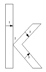
Determining the key featuresThe goals for this glyph are to control:
Figure 21 Geneva k: controlled distances
Creating the control value tableAn expanded control value table for Geneva, with the entries needed to instruct the Geneva k, is shown in Table 4.
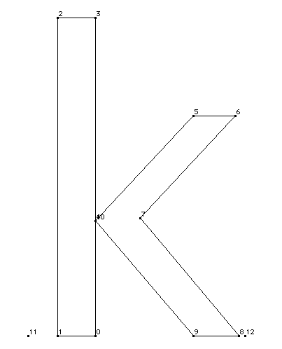
The instructionsThe instructions for the letter k are shown below. The outline points referred to in the instructions are shown in Figure 22.Figure 22 Lower case Geneva k
The instructions control the key points in the x-direction and the y-direction before
beginning to tackle diagonals. Once the grid-fitting problems in those directions are taken
care of, the diagonals are instructed. The instructions begin by aligning the left edge of the glyph to the grid and locking
it in place.
Control the width of the main stem.
The points connecting the main stem to the diagonals are aligned in the x-direction.
The inside of the diagonals in the x-direction (and subsequently the black body width) are
controlled rather than the outside because, in this k, the way the two diagonal strokes come to
a point is an important feature. It is important to grid align the points in that crotch in the
x-direction, and control both points in the y-direction as well to maintain their existing
relationship. Subsequently the diagonal stem weight will be controlled from that side of the stroke.
Points 4 and 10 will not be moved again.
The relative relationship of points 9 and 8 is preserved with the shift instruction.
The top diagonal is aligned with the bottom diagonal.
Points 6 is shifted much as point 8 was earlier.
The crotch of the k is adjusted to reflect the movement that has taken place in the
diagonals.
The freedom and projection vectors are set to the y-axis so that instruction in the
vertical direction can begin.
The glyph is tied to the baselines with a control value table entry.
Points 8 and 9 are aligned so that they will be in their final location in the x-direction and the y-direction before the diagonals are instructed.
The top of the glyph is held to the cap height using control value table entry 0.
Point 5 is aligned to the x-height using a control value table entry. Point 6 is then
aligned with point 5.
The positions of points 4, 7 and 10 are adjusted relative to the baseline (point1)
and the x-height (point 5) using an interpolation in the y-direction.
Once all instructions in the x-direction and y-direction are complete, the
instruction of the diagonals can proceed. The projection vector is changed to make movement
perpendicular to the lower diagonal. Movement will be in the x-direction.
The lower diagonal is instructed first. Point 8 is moved until the width of the lower
diagonal is that of a lower case straight stem.
The width of the upper portion of the lower diagonal is adjusted in a similar manner.
The upper diagonal is now instructed. The projection vector is reset to be perpendicular to the upper diagonal. The remaining instructions mimic those used on
the lower diagonal.
A final tricky problem involves the need to move point 7 to control the upper diagonal stroke
weight. This point is already in the right place for the lower diagonal. If the freedom vector
is set parallel to the line which is already controlled, we can fix the upper diagonal without
disturbing the lower.
Lastly, the changes made are interpolated over the untouched points in the outline.
A sample font programThe font program is used to define function definitions and, in rare cases, instruction definitions.Function 0 reads a value from the control value table, rounds that value, and writes
the rounded value back to the control value table. It takes two parameters. At the
time the function is called, the item at the top of the stack should be the control value
table address from which the value is read. The second item on the stack should be the control
value table location to which the value will be written.
A call to function 0 might look like this:
Function 1, shown below, can be used to control serif width. Control value table entry
3 holds the appropriate value for the New York serif width. It takes two parameters,
the reference point number and the point to be MIRPed.
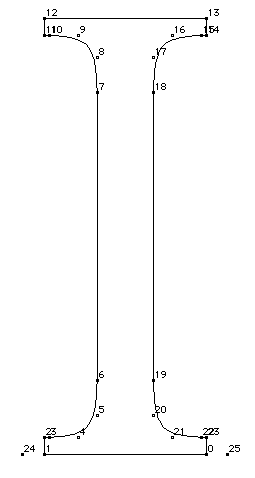
Function 1 can be used in instructing the upper case I as shown below.An extended
control value table for New York is given below.
Figure 23 The uppercase New York I
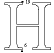
Point 6 is "dapped" so that it can serve as a reference point for future instructions.
The stem width is controlled by "MIRPing" from point 6 to point 19.
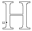
Successive function calls, made with the LOOPCALL[] command, are used to control the four serifs.
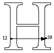
A second MIAP[] is used to control the cap height.
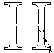
A MIRP[] is used to control the left serif height. An ALIGNRP[] instruction is used
to align the bottom of the right serif with the left.
Interpolate in x-direction and the y-direction to distribute changes made to instructed points
to those that were unaffected by instructions.
A sample control value programThe control value program is a set of TrueType instructions that are executed once when the font is first accessed and again whenever the font, point size or transformation matrix change. The control value program is stored in the 'prep' table.A sample control value program is presented below. It begins by setting the value of scantype and establishing a new value for the control value cut-in.
The next set of instructions are used to establish an alternative control vaue cut-in
for cases where the number of pixels per em in a glyph is less than 50. In such cases
the default is set to 128/64ths, which is two pixels.
Next a number of points are established in the twilight zone. The first step is to
set the zone pointers to refer to the zone 0, the twilight zone.
The vectors are set to the y-axis so that vertical relationships can be controlled.
A point is established at the rounded ascent height.
Reference point 2 is set to the ascent.
A third point is established at the unrounded cap height.
Function 0 is called to read, round and then write back the newly interpolated control
value table entry 0. Since the function now called does not access any points in the
glyph zone, it is unnecessary to reset the zone pointers to zone 1. The default value
for the zone pointers will be automatically resetablished for each glyph program.
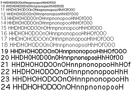
Checking the resultsThe best test of whether a font is successful is to view examples that are typical of the expected use. Look at examples of what you intend to print. If a font is expected to serve as a screen font on a 72 dpi device, look at sample test at 10 and 12 point on the screen. Other tests can be useful, however, in isolating particular problems.The waterfall, a line of text that is repeated at sizes that decrease by one pixel per
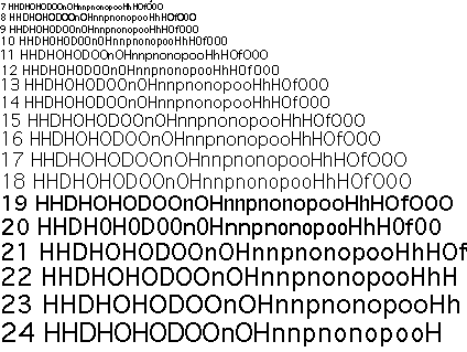
em, makes weight jumps more apparent. A waterfall with screen fonts is shown in Figure 25. Figure 25 shows the same text on a high resolution printer. Figure 24 A waterfall with 9 to 24 point Geneva at 72 dpi
Figure 25 A waterfall with 6 to 24 point Geneva
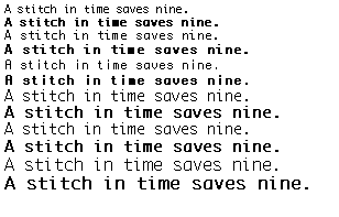
Comparing text from the bold and plain variations of a font at a succession of sizes
allows you to ensure that they are readily distinguishable. Figure 26
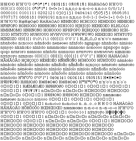
Spacing tests allow you to see how letters look in context. Examine each upper case
letter between the H and the O. This allows you to see how the glyph will look next
to a flat and a round glyph. For lower case letters use the n and the o. Figure 27 A spacing test with 12 point New York
Another useful test is to look at capital letters followed by lower case. Figure 28 Capitals followed by lower case glyphs
Pangrams allow you to see the entire alphabet in a small amount of text. Figure 29 A pangram
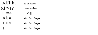
It is also important to check the alignment of the ascenders and descenders and to
compare characters posessing similar characteristics. Figure 30 Sets of related glyphs
|
